Cases

We had a Soundboard session with Satori, a fruit and vegetable importer from farmers around the equator. They wanted to do something against the waste of food and re-use residual flows.
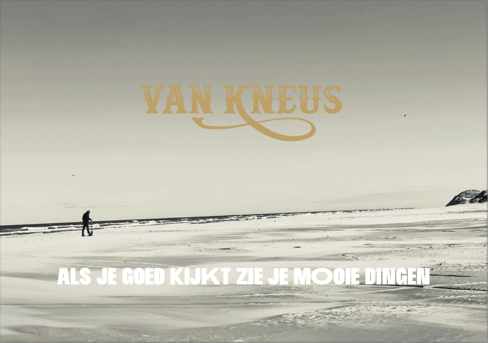
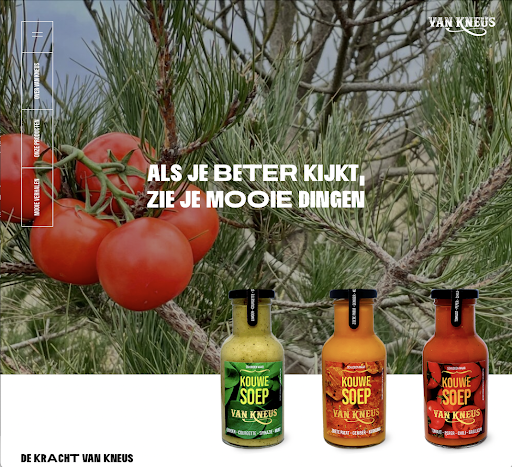
We created a the brand name Van Kneus (which means From Bruised), the brand strategy, brand design, packaging, products, website and the business plan.
The objective is to reduce waste and stimulate a new mindset, where ‘bruised’ is still great and very tasteful.
The driving idea (translated) is: “If you look closer, you see beautiful things” which has an amazing value and lesson in it.
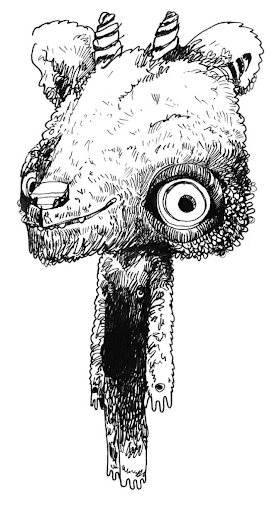
Especially focussed on children we created Gromm. He lives in the land that exists just between the cracks of your eyes. It’s beautiful and mysterious and there’s more to it than you think. Certainly more things than in the ordinary world, but you have to see them. He’s the spokes person when it comes to new products for children like a pizza bottom and how to decorate it with left-overs from the fridge….
Check out www.vankneus.com

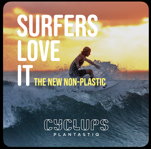
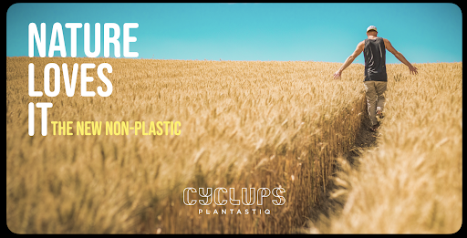
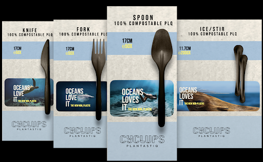
Their old name is Eco Wheat Collection and they produced straws and cutlery made from wheat (imported from India and saved from being burned, causing great pollution), instead of plastic. Their mission: Create a plastic-free world!
When we had our first Soundboard session and advised against the ‘old name with some good arguments.
After that we came up with their new name Cyclups with plantastiq’ as tagline. The driving idea is ‘Back to Nature’ (products and mindset), which inspired the design of website, products, packaging and communication our team created. The name PLQ is used as the non-plastic granulate that can be used by third parties.
We trained their sales team, creating a sales presentation and created Cyclups Academy, a series of lectures about mindset, non-plastic products and a plastic-free world. Also our team wrote their blogs and created their social media posts.
Check out: cyclups.com
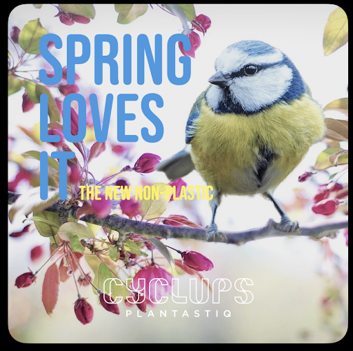
We love spring
Where new live begins
Beautiful, all things
and little birdies sing
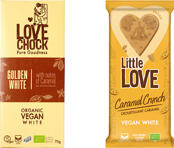
Our relation with Lovechock (chocolate made from vegan raw cacao giving farmers a fair price) goes way back, right to where they just started.
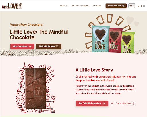
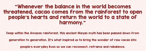
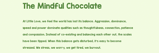
This time they came to us with a new brand that had to be introduced, called Little Love. It was targeted at supermarkets. in the process we found an old Mayan wisdom (see at the right) and we came up with the idea of “the first mindful chocolate in the world”. From there we created their (social) stories.
Parallel we re-positioned LoveChoc (the original brand, bio stores). We had to because ever since they started things have changed and many (private label) brands jumped in that cart wagon.
It’s LoveChock that started the movement of a chocolate that makes a sustainable contribution to the well-being of people and the planet, rewarding the farmers in a fair way. She’s ‘the mother’ of Little Love, so Little Love could ‘behave’ as the daughter, starting the new generation.
Check out little.love and lovechock.com

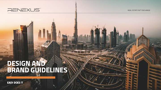
Renexus is an interesting and still ongoing project.
The objective of the company, based in India with offices in Singapore and Dubai, is to help ‘small-pocket-people’ to invest in real estate, one of the strongest assets in the world (next to gold), using NFTs (yes Crypto currency) and generate a better ROI than a savings account.
In fact, we’re creating the first Real Estate NFT Exchange in the world. It’s a complicated and ‘scary’ thing, that’s why we made the driving idea as simple as possible and very pretty straight forward “Easy does it”.
The idea behind it, obviously, is that we make profitable investments accessible for common people. It’s still work in progress, but as we speak we have a community of almost 20.000 people investing and making profit.
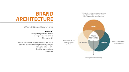
We created the brand name and brand book and are currently working on the technical platform, the website, the introduction of a new token and the marketing around it.
So, still work in progress (we can share brand book when we meet)

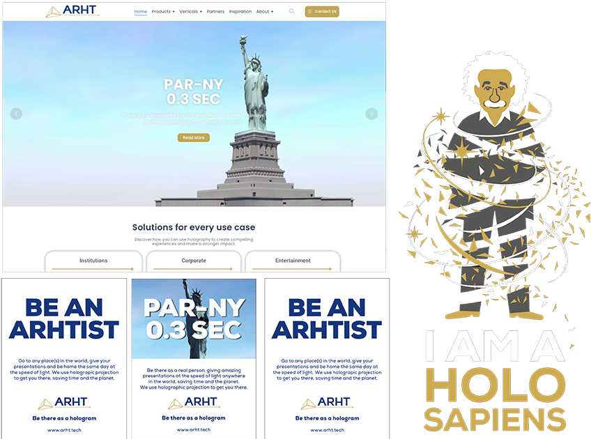
It started with the request of creating a new website for ARHT replacing the old one, a company that does holographic projections around the world, and resulted in a complete make-over of the brand, logo, positioning and communication style.
Our credo was “Resist the usual” When the competition was still explaining the technology, ARHT went beyond the technology, showing the advantages.
Also we ‘redefined’ the competion. Not just companies offering Holographic Technology, but also airlines and travel companies and by doing so, we highlighted the service and the ‘make it easy’ aspect of ARHT, using ‘Space Time Travel Company’ as the driving idea and introducing Holo Sapiens.
The result is a free and dynamic design (space, airtliners) and challenging communication focussed on the advantages of using holographic projections. Besides creating impact as a presenter using this technology, it saves time and the planet. Biggest advantage? Be home for dinner.
Be there as a hologram
Check out ARHT.tech